Wedding Websites

Landing Page Redesign + A/B testing to increase user conversion
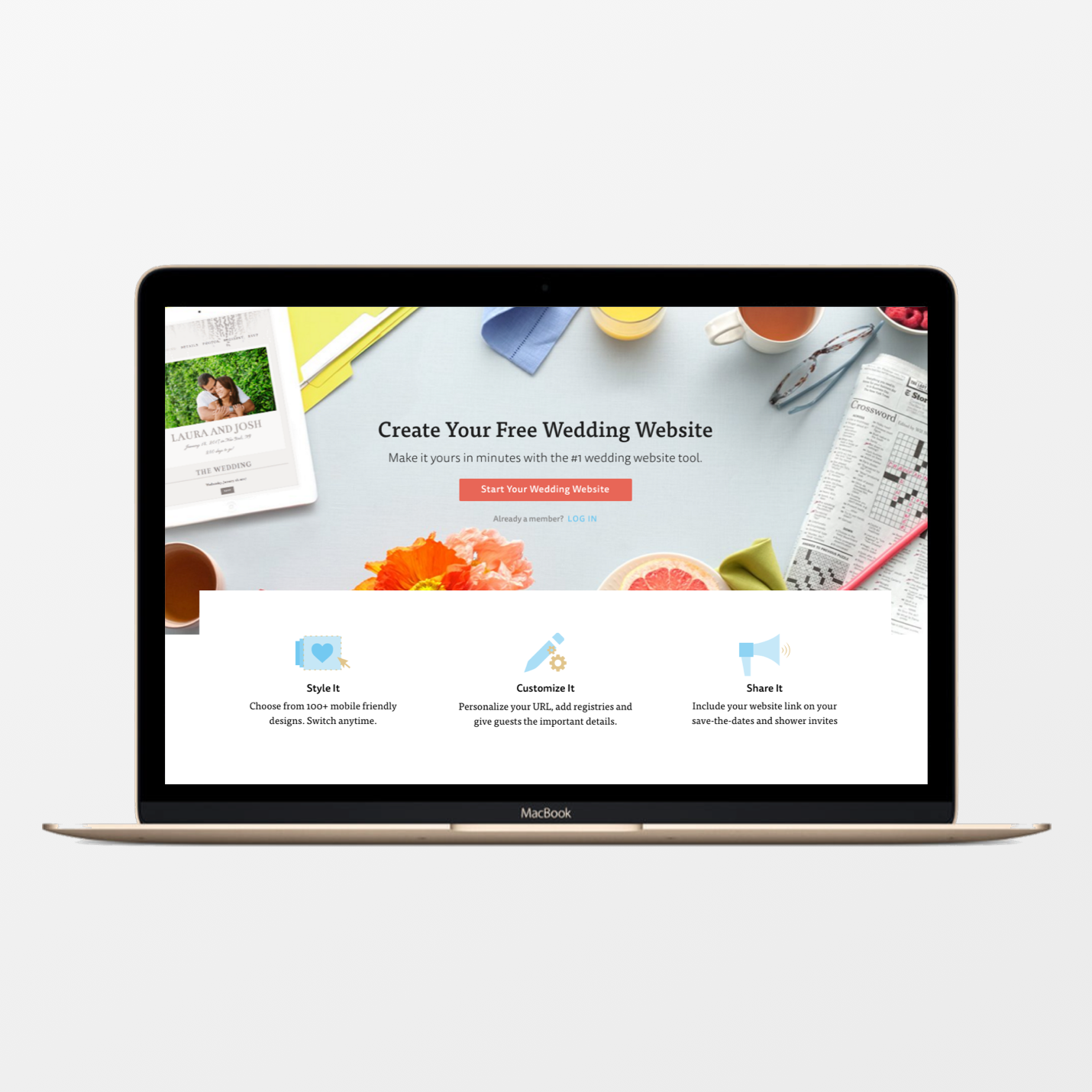
Landing Page
User feedback indicated that couples using the tool were unable to locate some of it's key functionality, and because of that often found the tool to be inadequate. As a result of this feedback the primary goal of this redesign was to improve feature discoverability/usability in order to better facilitate couple and guest communication.
Approaching the redesign of the landing page for this tool, I worked with our Lead User Researcher to set up a series of competitive studies. The goal of these studies was to better understand how initial impressions of the product offerings compared to those of our biggest competitors (Wedding Wire, Riley and Grey, Wedding Window…etc.).
Based on the results of our research, the primary goals of the redesign involved working closely with our marketing team to identify and align on the key value props that should be emphasized. Removing extraneous information on the page in order to reduce cognitive overload. The redesigned landing page that we released resulted in about a 10% increase in conversion (defined as the completion of the entire wedding website create flow).

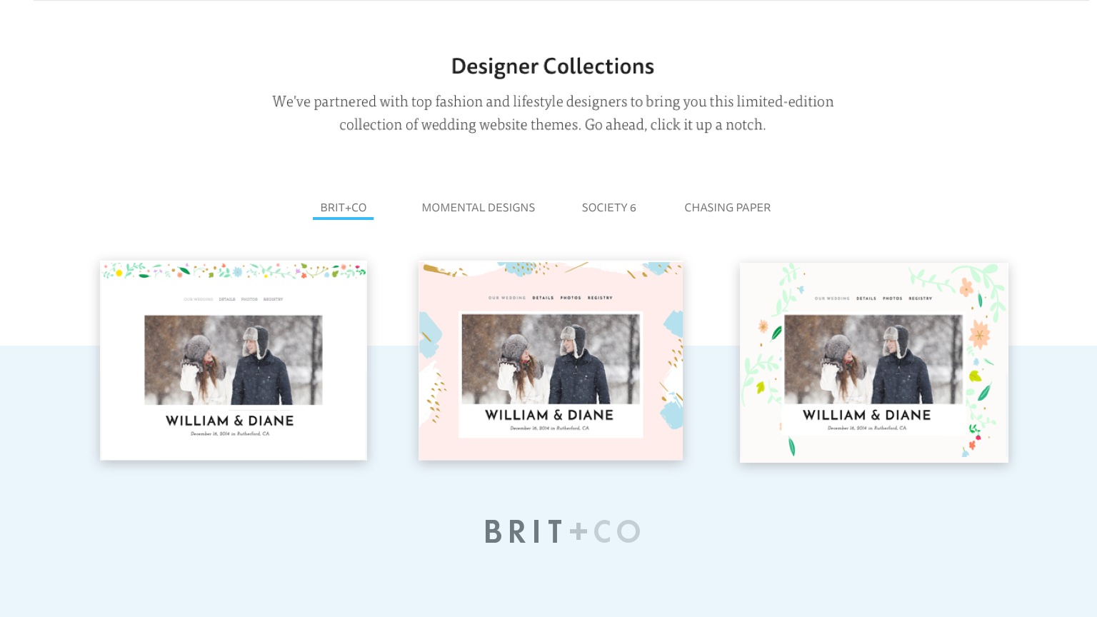
Featured Designer Panel
After the page was launched we conducted a couple of A/B tests to determine whether or not the order of contents on the page had a significant effect on conversion. Did people want to read about the features first? Or did they want to see what types of website themes were offered? As it turns out, the effect that changing the order of the contents on the page had on conversion was not statistically significant.

Illustrations and Icons


